Interior decoration refers to the decoration and furnishing of interior spaces in homes, offices, schools, and public spaces. It deals with all aspects of lighting, color, texture, paint, buy furniture and layout, selection and installation of floors, installation of fabrics, window treatments, and accessories. An interior designer is charged with implementing or updating is complete and the elements to be included in the room .Purpose of Interior decoration was created to share about the interior decoration to create a peaceful and harmonious as the case may require users who want to refer to the interior decor is in accordance with the specific requirement.Interior not limited to the internal decor but will also discuss the external decorations for balancing information on the decor.Cheers.....


Wednesday, October 27, 2010

Samples......Floor Tiles


Select one suits your needs.....budgets

Tiles....selection.....option

Ceramic Tile Selection

Selecting the proper type of ceramic tile for your project is probably the most important installation decision you will make. Here are some tips to help you in your purchase:

Ask for consistently sized tiles. Ceramic tile is fired in a kiln and then cooled at varying degrees of temperature and humidity. This expansion and contraction can cause the tiles to vary in size, sometimes by a 1/4" or more. Most ceramic tiles on the market will have some variation in size but accept nothing more than a 1/8" margin of difference.

Make sure the ceramic tiles you purchase are of the same "Shade#" and "Lot#". This will ensure that your flooring was made in the same batch.
Unless you plan to purchase a high quality wet saw we recommend you refrain from using fully vitrified porcelain tiles for interior installations. Fully vitrified porcelain tiles are difficult to cut with accuracy with a straight tile cutter and this means every cut you make may be on a ceramic tile saw.
Select a ceramic tile that is relatively smooth and has straight, flush edges.
This will make your grouting job a whole lot easier.
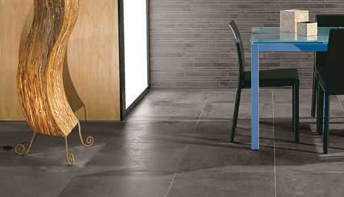
Use 8" x 8" or smaller sized tiles on walls and countertops. For floors use 14" x 14" or smaller tiles.

Ceramic tiles with bright reflective surfaces (bright glaze finish) are not recommended for floors as they can pose a slip hazard and have poor abrasive resistance.


PEI Ratings

Although there are no industry standards, most ceramic tile is rated for use by the Porcelain Enamel Institute (PEI) abrasion test and is recommended by the American Society Testing Materials (ASTM). PEI ratings measure the wear resistance of the tile surface.

Class 1 - No Foot Traffic:
Ceramic tile suggested for interior residential and commercial wall applications only.

Class 2 - Light Traffic:
Ceramic tile suggested for interior residential and commercial wall applications and for residential bathroom floor applications only.

Class 3 - Light to Moderate Traffic:
Ceramic tile suggested for residential floor, countertop, and wall applications.

Class 4 - Moderate to Heavy Traffic:
Ceramic tile suggested for residential, medium commercial and light institutional floor and wall applications.

Class 5+ - Heavy to Extra Heavy Traffic:
Ceramic tile suggested for residential, commercial and institutional floor and wall applications subjected to heavy to extra heavy traffic.


Acceptable Outdoor Tile Types

Ceramic tile installed in exterior locations must be able to withstand freeze/thaw conditions meaning they should have an absorption rating of 3% or less. These types of tiles are usually very dense, have greater impact resistance, and increased breaking strength. Install them using a premium quality, latex modified thinset mortar.

Vitrified, ceramic tiles having an absorption rating between 0.5 - 3%.
Impervious (Porcelain), ceramic tiles having an absorption rating between 0.0 - 0.5%.

If price is a factor in your decision to purchase ceramic tile, contact your local tile wholesaler/distributor. Nearly all will have deals on discontinued and overstocked ceramic tiles and unlike your local home improvement store they can answer detailed questions regarding your tile project.

Samples in the next post.....

Monday, October 25, 2010

Dining Room.....

Having plan to remodel your dining room? We bring you a few ideas to imagine. Whether it is that you might want your dining space to looks modern, contemporary, cozy, formal or anything else. Whatever you can imagine right from a simple chair to dining table and side tables and chandeliers, we try to provide the idea of it. If you like a certain accessory in this collection and want to buy it, try it as you like. If you are happy with their arrangement of dining room, nobody would stop you. If you are toying with the idea of doing a dining room-make over go through the snaps below and you-never-know you would end up thanking us for coming up with this article at the right time!!!

Please go through and try to achieve what you call satisfaction in deco.....

 You call this classic???

A few choices of modern style


Have fun with yer dining decoration…..Please share as you like.

Wednesday, October 20, 2010

Samples.....Wall Color


Which color inspire you.....it's yours

Effect of Home Color

The following description of some of the paint color options and an explanation of meaning and influence of your mood:

Red 
Describing full of energy, active, warm and vibrant. Excessive red color to give the impression of anger and ambition.

Yellow 
Yellow color reminds the sun which gives good energy and spirit. Often equated with gold color depicting prosperity and luxury. Can be applied in the study.

Blue
It is the color of sea and sky that suggests calmness, silence, peace, comfort and protection. Another effect is to give the impression of relief and wide. Suitable for the bedroom.

Orange
Suggests cheerful, warm, happy, full of energy and uplifting. You can give this color to the dining room.

Green 
Colors are often seen and described the nature. The effect of this color is to provide an atmosphere harmonious, calm, relaxed, natural, soothing, refreshing and calming. Bedroom suitable when using this color.

Brown
One of the natural colors that give the impression of a warm, comfortable, natural, intimate and quiet. Can be used for living room or family room. Chocolate can also be used in the room that is too large to avoid the impression of cold.

White
Neutral colors are properly used with any color. Using this color is generally described cleanliness, innocence and purity. Its use in the room will give a greater impression on the room. When will describe the excessively sterile and cold. If you have a modern kitchen, color is also suitable to indicate the cleanliness of your kitchen.

Gray
Usually used for home-style minimalism. Creating a stable atmosphere, broad, reassuring. Too much use of these colors will make the atmosphere cool and overly broad.

Black
The color that gives full protection of the atmosphere, handsome, stately, and elegant.

Change the atmosphere can also be done without having to paint the whole house. You can rearrange the interior space. It is also suitable for those of you who do not want to paint the house or are afraid of applying color. For example, still allow the walls with neutral colors and the colors can be applied on table lamps, carpets, curtains, sofa, bed linen, desk, sofa pillow cushion covers, or in a display that is placed in the room. The colors of this furniture which in turn will give color to the room.

You can also use derivatives so that the color can be applied to more than one color in the room. The color space can also vary but there must be a liaison so that the house still feels as one union. Now, you can express yourself freely while doing renovations to your home.


Meaning of Color


Want to change the atmosphere of the house? One way to change the atmosphere of the home is to replace the paint colors that match your character, but to adjust the overall interior room. Color space plays an important role in the interior of the house, because it is a picture of the character of its owner, gives a certain impression in the room, strengthen and become a unifying whole interior of existing space. So before painting the house and set the home interior decoration, you should understand the meaning and effect of each color.

Choosing House Color


It is important to choose carefully paint your house. Color can give more than just beauty to your home. Something colors can have an effect on mood or a person's mood. Colors are bright and shiny will add to the spirit, while the pastel colors will make the atmosphere calm and relaxed. Some color may appear dark when used on the walls inside the building, but the same color can also be seen light outside the room.

For fear of not matching and is considered excessive, most people use neutral colors like white, cream or gray to paint the entire house so as not to describe themselves occupants. Given the importance of color, so if you are designing to paint the house with new colors, it helps you know the meaning of which is described from a particular color.

Note the picture Color Wheel Color Wheel or on the side, which describes the arrangement of colors. Colors that lie directly opposite positions on the Color Wheel to one another is called complementary colors. If the colors are placed side by side, it will increase the intensity of color or referred to as a bold color.


As for colors more conservative and not a bold color, then choose some variation of light and dark in the same color. For example, choosing dark green and light green. The color type is called a monochromatic color.